


Movie Posters: LIFE DURING WARTIME (2010) and Other Films by Todd Solondz

 Todd Solondz is one the most distinct filmmakers we have working today. Like watching one minute of a random movie by either Neil Labute or David Fincher without warning, you know it is by Solondz when you see one of his. My high anticipation for his new film Life During Wartime (2010), which premiered last year at TIFF (Toronto International Film Festive), is matched by seeing what its movie poster will look like — and for good reason. Over Solondz’s career from Welcome to the Dollhouse (1996) to Palindromes (2004), the posters of his films have been consistently inspired and in tune with each other. Their designs and illustrations(!) convey the sweet and sour qualities of his controversial themes, which engage and then subvert our expectations. Whether it is Solondz’s direct influence or just what each different advertising company happens to come up with when facing his material, the results in style are remarkably alike.
Illustrated movie posters have been a dying breed for the past quarter of a century. Most of Todd Solondz’s films have kept that art on the respirator starting with Daniel Clowes’ take on Happiness (1998) and then what Kathryn Rathke ran with in Palindromes (2004). Life During Wartime (2010) continues down that illustration path – it’s very appropriate since Life is the sequel to Solondz’s Happiness – but not before some photographed design comps were made. Before unveiling the illustrated version, I will take you through how it evolved starting with the international poster made for the film.
LIFE DURING WARTIME (2010) International Poster

Beginning last April on Todd Solondz’s unofficial website, an international poster was released featuring Dylan Riley Snyder. After ten years of Happiness (1998), the character who Synder plays is Timmy now at fourteen. His four-year-old counterpart in the original was played by Justin Elvin whose main priority in the previous film was his Tamagotchi. For such a minor character to be the focus of the poster (“Either Scooby is the focus or forget it!”), it looks like Timmy is going to have a lot more to do in Life During Wartime. It’s not surprising what with his upcoming Bar Mitzvah and the prison release of his “SERIAL RAPIST PERVERT” father Bill (Cirian Hindes takes on the role made immortal by Dylan Baker).

For a movie that is going to deal with pedophilia among other taboos, setting Timmy in a lovely field of flowers is terrifically disturbing. Especially that glazed look in his eyes. However, the execution of the design work looks like a hurried first draft that needs more improvement. Next up, it appears that the designers back in the US thought so too.
LIFE DURING WARTIME (2010) US Poster

Where the first design reeked of amateurism, this version of the poster is much better. The typography of the title and its “film by” credit has been lovingly modeled by hand. Each letter has a life all its own. As a whole, it works harmoniously in this carefully thought-out composition. Isn’t it cool the way that cursive line in the word Life goes from the L down to the D in During and then up to complete the e? Brother, am I ever glad that they turned the film’s credits into one single block of text.
The photograph of the poster has also been rightfully reworked. Starting with Timmy’s head, I’d just as soon believe that the first poster shrunk it. Even if that was the way Mr. Snyder’s photo was taken, his head looked wrong. My philosophy of design is that a wrong picture is best so long as it looks right. The head in the improved version has not only been made larger to push the “child” look, it has been colour corrected to amplify the boy’s “Gingerness” — Cartman would cry at this sight. His glazed eyes have also been blown up a bit and the irises are lighter.
To pull our attention to the pinks and oranges up top, the tulip Timmy is holding has been changed from red to white. His clothes have been ironed over to an impossible smooth. The green grass and hills have been softened and altered anew to look more pastoral and dreamlike. The yellow flowers have been replaced with smaller ones that don’t crowd the bottom of the poster. Even the sky is new with fluffier, whiter clouds that merge evenly with even fewer hints of light cyan.
With all of these improvements made, the poster is still straining towards that punch of immediate excellence. Thank our lucky stars that the last poster was used as a template for a complete realization.
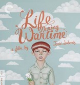
LIFE DURING WARTIME (2010) Poster by Akiko Stehrenberger

 Perfect! This final poster (and most certainly the last one) was created by the design company called Mojo, which elected its in-house talent Akiko Stehrenberger to illustrate it. Last year, Stehrenberger was responsible for these sweet movie posters of (500) Days of Summer and A Serious Man — it’s too bad they were past up. For Life During Wartime, she broke out her acrylic paints and rendered one of most vividly creepy movie posters ever conceived.
The clouds are purposefully designed into a unified shape, which all create a hollow effect around Timmy. The flowers are all gone leaving a clean, green field. Those glassy eyes along with the few perfectly symmetrical freckles (his breast pockets and knees are also symmetrical!) and the shiny plasticity of his hair makes the young boy look like the product of a doll-maker. The only real humanness left of Timmy can be found is in those lush, plushy, moist, pink lips — EEEUUWWW!
Stehrenberger subtlety zeroes in on “ICK!” factor here. His limbs and clothing are rendered with a gradating shade that highlight in the middle to emphasize the three-dimensional cylinder forms. Despite how straight this illustrated Timmy standing compared to the photograph, Stehrenberger still kept that single wrinkle on the right side of his shirt. Perhaps it’s part of a pederast’s subconscious view to grab the wrinkle like a handle and pull his shirt up and off. Again, eeeEEEHHHUUWWW!
Bravo, Stehrenberger! Bravo!
The original title of the film was supposed to be Forgiveness, a single word that would have married nicely to Happiness. The next question isn’t why the title has been changed because the characters like us all are living in a time of war – officially with Iraq and unofficially with North Korea. Judging from the trailer, the twist Solondz is making with Life During Wartime is that these Floridians and Americans are carrying on quite comfortably with the Iraqi War all the way over there. Then again, their very lives have already made these poor souls casualties.

A picture from the film released last September as part of its publicity campaign shows Helen (the Lara Flynn Boyle role taken on Ally Sheedy) in front of a giant photograph depicting a tank in a third world country. I strongly suspect that that is the closest any of the Happiness characters will get to a war zone, unless Solondz goes all Alex in Wonderland (dir. Paul Mazursky, 1970) and brings the soldiers and firebombs to America in a character’s fantasy-trip. It wouldn’t be the first time Solondz brought us such a marijuana-induced fantasy like he did in Storytelling (2001) complete with a burning at the stake and the redhead of Conan O’Brien.
The real question from the title change is can forgiveness be possible for these characters. It seems that would be the major thing Bill would want after his release into the world.


The cast of Life During Wartime (2010) from left to right:
Allison Janney (Trish Jordan), Michael Kenneth Williams (Allen), Shirley Henderson (Joy Jordan), Ciarán Hinds (Bill Maplewood), Ally Sheedy (Helen Jordan), Renée Taylor (Mona Jordan), Paul “Pee Wee Herman” Reubens (Andy Kornbluth)
LIFE DURING WARTIME (2010) Trailer
It’s the same trailer as the UK trailer from March 31st.
HAPPINESS (1998)
![]()
HAPPINESS (1998) Poster by Daniel Clowes

Here Daniel Clowes renders the characters in Happiness (1998) as caricatures full of anxiety, suspicion, and anger. Yet part of Clowes’ personal style is to downplay their physical features as human and exactly proportioned. The strained emotions on their faces threatens to blow their faces up like they were compressed of bolts and flesh. They counterattack the bold-faced title that hangs above them out of reach.
The cast of Happiness (1998) from left to right:
Cynthia Stevenson (Trish Maplewood), Camryn Manheim (Kristina), Jared Harris (Vlad), Philip Seymour Hoffman (Allen), Lara Flynn Boyle (Helen Jordan), Louise Lasser (Mona Jordan), Dylan Baker (Bill Maplewood), Jane Adams (Joy Jordan), Jon Lovitz (Andy Kornbluth), and Ben Gazzara (Lenny Jordan)

Daniel Clowes Talks About His Happiness Poster:
?t=17s
Running Time: 2 minutes.
On Todd Solondz’s News Website, it turns out that Bill (Dylan Baker) was originally supposed to die at the end of Happiness:
 If you missed Christine Vachon and David Edelstein’s auto-job-ography Shooting To Kill: How an Independent Producer Blasts Through the Barriers To Make Movies That Matter, here is the text referring to an alternate sequence in Happiness, in a chapter on special effects. It reveals the ultimate fate of Dylan Baker’s character that was never shown in the finished version: “(In Happiness, the character Bill was supposed to) open a package and get blown up. We debated ways of doing it – from moronically inexpensive (cut from the character opening the box to someone next door doing dishes and hearing a BOOM! while the camera shakes) to the Schwarzeneggerian (blow up a whole house). We also thought about blowing up a miniature. In the end, we built a fake front door on the house, blew it off its hinges, and pumped out a lot of black smoke. It cost about two thousand dollars.”
HAPPINESS (1998) Trailer
PALINDROMES (2004)

Kathryn Rathke produced this brilliant poster (voted (#9/10) Best of the Decade by Adrian Curry of MUBI) for the ad agency Supermarket Studio. Rathke has produced a number of illustrations for Alice in Wonderland in a style that is loosely based on the Wonderland drawings of Sir John Tenniel, but is all her own. This transition was easy for the classical fairy-tale book style Rathke uses for the poster of Palindromes (2004). Everything in this watercolour picture from the calm, staring lamb to the lush greenery of the forest is serene and enchanting… except for the large black woman dresses like a thirteen-year-old.
 The central figure of poster demands speculation. This is one of the eight representations of Aviva (Aviva><avivA), the main character who at the age of thirteen is determined to mother a child immediately no matter what. The purpose of this is to demonstrate how issues involving pre-teen pregnancy as well as the abortion debate are universal among women no matter their race, sex, class and age is. Sharon Wilkins (plays the incarnation of Aviva as a black woman in her thirties and does a really terrific job at playing a teenage girl. At that point in the film, Aviva wanders into a comfortable compound for children deformed at birth. It is run by the scary-cheerful Mama Sunshine (Debra Monk) who has outfitted the kids with stereo equipment to form a Christian Rock band called “The Sunshine Singers”. Aviva’s explanation for her parents whereabouts to Mama Sunshine is shockingly funny.
“The Sunshine Singers”
![]()
“Nobody Jesus But You!”
“The Dr. Dan Song”
![]()
You might want to watch the movie first before you see these song numbers!
Aviva is also played by Jennifer Jason Leigh who was forty at the time.
Aviva talks with Mark:
Oy vey, Mark…
PALINDROMES (2004) Outlined Poster by Kathryn Rathke

PALINDROMES (2004) Full-Colour Poster by Kathryn Rathke

What Ebert & Roeper Said About It
PALINDROMES (2004) Trailer
Why is it so hard to find a decent Palindromes trailer?
Coming Up Next:
STORYTELLING (2002) and WELCOME TO THE DOLLHOUSE (1996)!
Page: 1 2
© 2008 – 2026, CINELATION | Movie Reviews by Chris Beaubien. All rights reserved.