A VARIATION ON THE OLD IN ‘N OUT (2025):A New Short Film Shot in 8mm Coming Soon
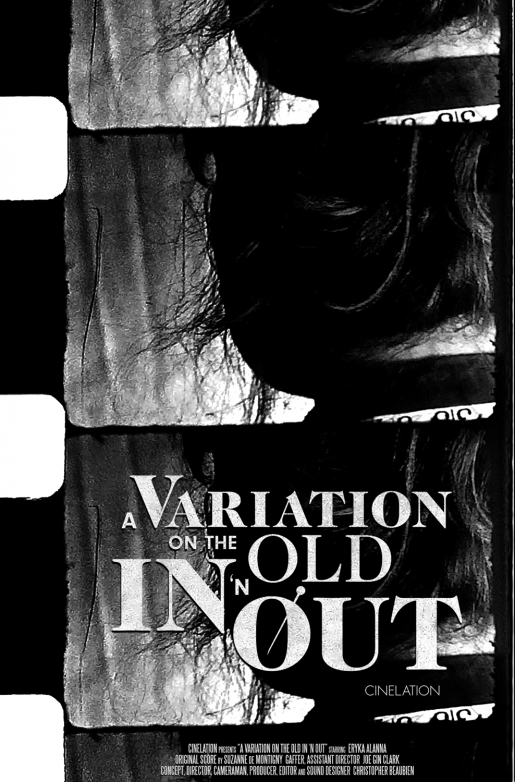
A woman suspects she is being watched.
My new short film “A Variation on the Old In ‘n Out” (2025) will make its World Premiere at the FogFest Horror Film Festival on November 7-10th in St. John’s, Newfoundland! It is wonderful to be welcomed back by the same supporters of independent film that screened my award-winning “SIREN: A Police State of Mind” (2020) in 2022.
This is the first time I shot a movie on analog film.
Last summer I attended a 8mm filmmaking workshop so I could work with analog film for the first time. I had only made my movies using digital cameras and wanted to change that. My instructors at Cineworks, an independent filmmakers society that I belong to as a member, were amazed that I brought in an actor and storyboards for the filmmaking session. Nobody had ever made a short movie in that program before. In back of mind were some of my favourite silent films such as “The Man with a Camera” (1929) and “Begotten” (1990). Without deliberation in the making of the movie, this film ultimately pays homage to one of the greatest scenes in film history that belongs to “Un Chien Andalou” (1929). I even scanned my developed film several times using a variety of changes in exposure and resolution size. After a very rewarding period of post production, I completed my first short shot in 8mm film, “A Variation of the Old In ‘n Out.”
The actress starring is Eryka Alanna who was featured in “SIREN”.
The music is by film composer Suzanne de Montigny.
Special thanks to everyone who made this film possible with me.





 Todd Solondz is one the most distinct filmmakers we have working today. Like watching one minute of a random movie by either Neil Labute or David Fincher without warning, you know it is by Solondz when you see one of his. My high anticipation for his new film Life During Wartime (2010), which premiered last year at TIFF (Toronto International Film Festive), is matched by seeing what its movie poster will look like — and for good reason. Over Solondz’s career from Welcome to the Dollhouse (1996) to Palindromes (2004), the posters of his films have been consistently inspired and in tune with each other. Their designs and illustrations(!) convey the sweet and sour qualities of his controversial themes, which engage and then subvert our expectations. Whether it is Solondz’s direct influence or just what each different advertising company happens to come up with when facing his material, the results in style are remarkably alike.
 Two weeks ago, Chicago-based film reviewer codenamed Quint (real name: Jim Fyfe) from