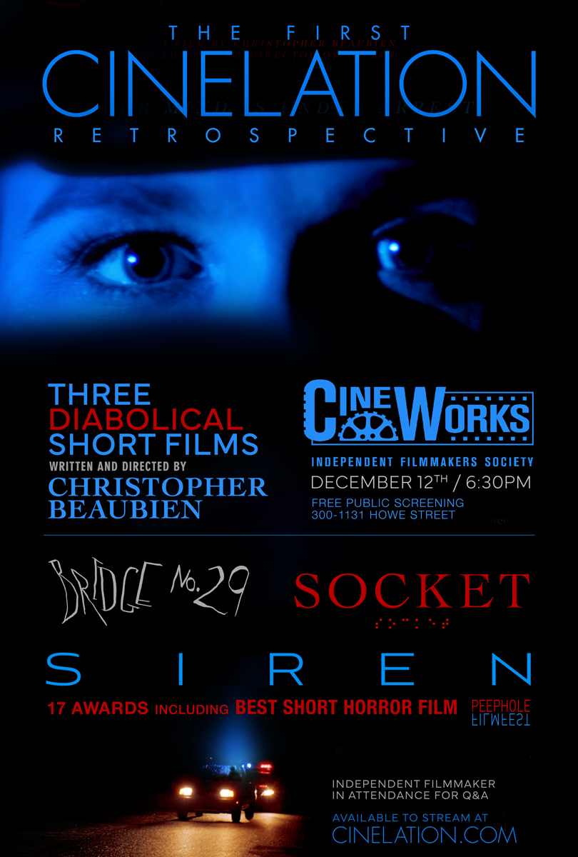


The First CINELATION Retrospective is Happening
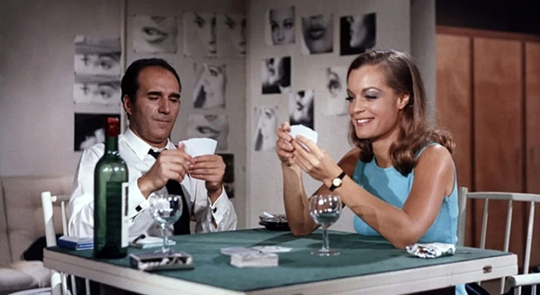
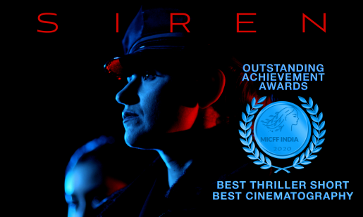
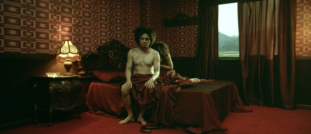
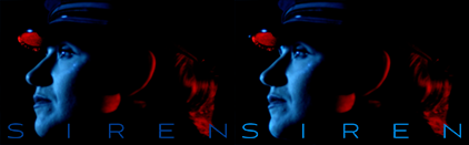
With the support of the Cineworks Independent Filmmakers Society, I will be screening three of my favourite short films together for the first time on the big screen next Tuesday, December 12th. These macabre works include Bridge No. 29, Socket and the award-winning Siren.
The First CINELATION Retrospective will celebrate the last ten years I have worked diligently as an independent filmmaker with a great assortment of talented and dedicated artists. I hope you will brave the cold to enjoy a rare opportunity to experience these three films.
The Black Box Studio is located at 300 – 1131 Howe Street behind the Cinematheque. Since the entrance is down a back alley, I encourage you to bring a friend.
The First CINELATION Retrospective takes place on December 12th at 6:30pm.