Movie Review: HOUSE ON HAUNTED HILL (1959 + 1999) and The Curse of Colorization!
Colourization VS. Black-and-White
FIGHT!
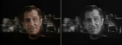
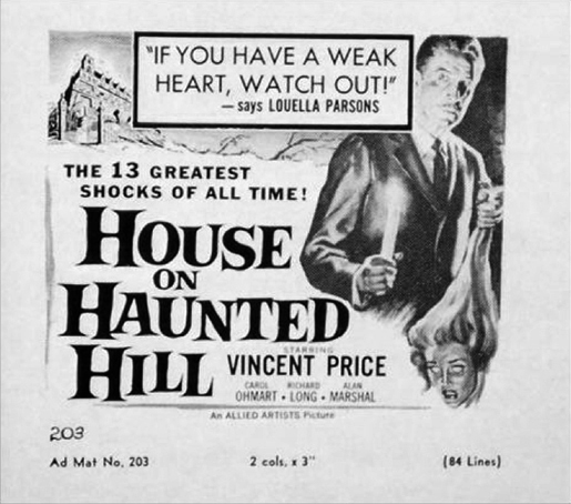
Here the colorization process has robbed the original print of its haunted essence. Doesn’t the black-and-white succeed at being more ghostly? The colored version only distracts with the emphasis on the literalness of a suspended human head. In black-and-white, I see a figurative spectre. In color, I’m wondering how Vincent Price got decapitated. Colorize and repeat: The mystery and mood of the image has been sucked dry.
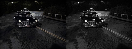
This example shows how unnecessary it is to colorize. The colorizers must have racked their brains on this one. It’s easy to imagine them taking careful notes about: “Oh! Oh! The traffic lines! Yellow! Yellow traffic lines! D’oh! Yellow headlights! Maybe just a little yellow… Those shrubs in the back! They should be green! GRRREEEEENN! Light your stogies, boys and girls! We’re earning our keep!”
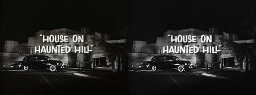
The black-and-white is a much sharper picture. Very striking. The color adds nothing. No, that’s not true. It adds a little fuzziness.
FYI: That is the Ennis Brown House designed by Frank Lloyd Wright in the Hollywood Hills.
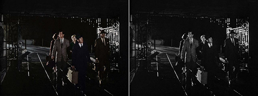
A perfectly ominous shot that is spoiled by those fleshy hues. It looks like they’re all coming back from a night at Lover’s Lane just on the outskirts of Pleasantville.
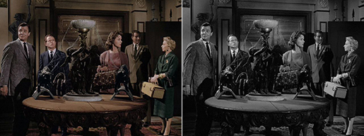
Now it’s time to uncap all of our color markers! Let’s make the table… brown. The walls can be kind of yellow. More like jaundiced. Let’s have some more fun! Every character gets their own color. Just like the Power Rangers. Hey, where’s the Red One?
Every colorizer gets a freebie. Lance can be the Man in the Gray Flannel Suit. One less suit that has to be colorized. Watson can be blue. Good taste. Nora can dress in pink because she’s a girl. Ruth can wear green because she’s older and pink is taken. Last and certainly the least, Dr. David Trent: What’s left? Purple? No, he’s not the Joker. Orange? He is not in California. Yellow? Really? Yellow! Okay, yellow. Choose the less of the three evils.
Wasn’t that fun?
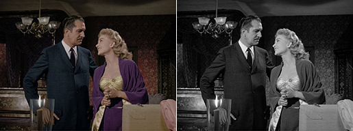
No contest.
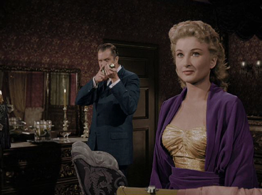
Look at that wallpaper. Just look at it. How much well-deserved carpal tunnel syndrome attacks did those colorists endure on those golden floral patterns?
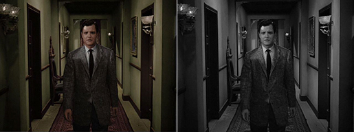
The black-and-white image makes the corridor look rather elegant.
Ick! The color version makes it look as if they’re staying in a drab and cheap set from the 1970s. Why not keep within the color palette of the hotel corridor from the Coen Brothers’ Barton Fink (1991)? I know someone who could show these colorizers “the life of the mind”.
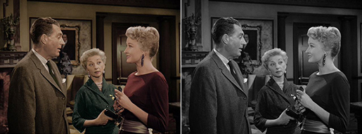
This is where deciding on a yellowish suit for Dr. Trent proves foul. It looks hideous up against that yellowish living room. But at least, we found the Red Power Ranger!
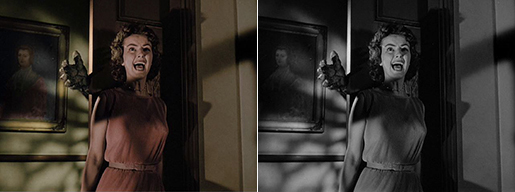
In black-and-white, I’m thinking, “Nora, watch out!”
In color, it looks direct-to-video. And she’s still wearing pink.
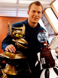 Also included on the DVD is a very entertaining commentary of pure mockery (or “mockommentary”) by Mike J. Nelson of Mystery Science Theatre 3000 fame. MST3K (1988-1999) was one of the defining touchstones on pop culture. What’s more fun than making fun of a horrible movie, target-shooting with zingers and making astute observations full of acidic snark? Here was a cable TV series where the witty hosts did exactly that while watching very, very bad movies — movies where the quality ranged from smelly cheese to anal leakage.
The premise had a mad scientist repeatedly torture our heroes stranded in a spaceship with bad movies in order to drive them all insane. I hope you smiled after reading that! Their only hope of surviving the movie-inducing lobotomy was by using their wits against the likes of The Incredibly Strange Creatures Who Stopped Living and Became Mixed-Up Zombies (1964).
Nelson was a head writer on the series who graduated to host-victim in 1993 after replacing the show’s creator Joel Hodgson after five seasons. The silhouettes of the back of Nelson’s head and those of his robot friends Crow and Tom Servo seated in a row of movie theater chairs would become as famous as Dr. Marvin Monroe’s face. MST3K was listed by James Poniewozik as one of Time magazine’s “100 Best TV Shows of All-TIME.”
Here are some snarky samples from House on Haunted Hill (1959):
Nelson: “Folks, if you do get a Vincent Price in your own home, don’t panic. Just call Animal Control and they’ll remove him. They have a large, humane trap they set up just for him and they release him up in the Hollywood Hills.”
Nelson, teeth dripping with snark over Elisha Cook Jr.: “Isn’t he due back in his hollow tree?”
One of his best visual jokes involves just how long it takes Nora to scan a room. As the camera pans across slowly to establish an empty torture chamber, Mike remarks, “Ah! This makes me miss Nora.” That is so good it belongs on a resumé.
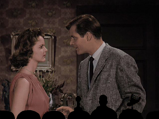
Nelson pokes fun at how Nelson tries ever so hard to hit on the women: “I know, it’s crazy for me to even suggest it, but he wouldn’t be headed to Nora’s room, would he?”
Nelson must have made his commentary while watching the black-and-white version because it’d be so hard not to make fun of the colorization. Though I bet he was contractually obligated not to take the piss off of that yellow living room. Like any good comedian, it all depends on the material. So long as he his targets range from The Dead Talk Back (1957) to Kitten with a Whip (1964), he kills. When picking apart a great film like George A. Romero’s Night of the Living Dead, he comes across as an annoying movie patron who just doesn’t get it. It’d be hell to make fun of a movie that was actually good. Though, he’s pretty funny with House on Haunted Hill, a movie so cheerfully campy that it invites some good-natured mocking. He also can’t help teasing poor Julie Mitchum that she’s… Robert Mitchum’s sister!
Classic MST3K: “Manos the Hand of Fate”
Mike Nelson’s Life at Legend Films
Siskel & Ebert on “MST3K the Movie”
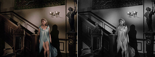
Contradicting my own case for a second, I must confess that the colorized version really makes Ohmart’s legs pop out of her nightie. My best Knox impression: “Hello, legs!”
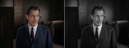
My proverbial cold shower is Vincent Price here. He looks more stark and foreboding in black-and-white. When colored unnaturally, it hurts him.
Yes, Vincent Price can look rather sinister in color like he did those Roger Corman movies House of Usher (1960) and The Pit and the Pendulum (1961). But those were well made in color at the beginning of their productions. Not only were they made with color in mind by those exercising their craft, but its photography was the best distillation of the recorded detail and hues that artificial colorization cannot achieve. It’s like making the Bye Bye Birdie (1963) theme song without Ann-Margaret. House of Haunted Hill is ideal for black-and-white photography, but its colored bastardization lessens its impact.
House of Haunted Hill is still pretty good little horror movie. It may not be as scary as it was fifty years ago, but that hasn’t diminished its entertainment factor. Its weaknesses in character development and a dozen plot holes only adds to the fun. Castle’s odd hybrid of camp and sincere showmanship make his best feature film a must-see among film buffs and horror movie fanatics alike. It stands up fairly well today, so long as you’re game for well-made corn.
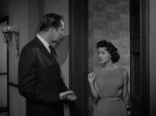
I can’t get over how Price towers over the petite Carolyn Craig.
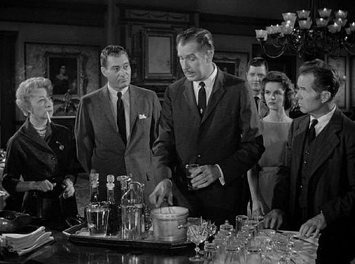
Oswald (A Zed and Two Noughts, 1985):
“And here is a reminder of how it really goes.”
“House on Haunted Hill” (1958) Trailer
Trailers from Hell: “House on Haunted Hill” (1958)
“House on Haunted Hill” (1958) Trailer – Colorized…
It could be worse! Legend Films could have colorized Carnival of Souls (1962)–
The Colorized Version of “Carnival of Souls” Trailer
Why do I give them these openings?
“Carnival of Souls” (1962) (Black and White)
There! All better…
Page: 1 2
© 2008 – 2026, CINELATION | Movie Reviews by Chris Beaubien. All rights reserved.


